Back to Blog flutter
 kubernetes
 ai
ai typescript
 showdev
 ai
ai agents
A Practical Guide to Flutter Accessibility Part 2: Hiding Noise, Exposing Actions
Karol Wrótniak April 24, 2026
0 views
In Part 1 you learned the basics. Semantics for labels and hints. MergeSemantics to remove double...
In Part 1 you learned the basics. `Semantics` for labels and hints. `MergeSemantics` to remove double announcements. TalkBack and the Android Ally plugin to check the results. That covers most of a typical Flutter app. But not all of it.
Some widgets are invisible to screen readers for a different reason. It's not a missing label. It's that assistive technology has no idea *how* to interact with them. A swipe-to-dismiss row. A star-rating control. A decorative icon that just adds noise. Adding a label to these won't cut it.
That's where Part 2 starts. You'll learn to hide what shouldn't be announced. You'll expose custom gestures as named actions TalkBack and VoiceOver can present to the user.
### A Broader Definition of Accessible
A widget with a label is a start. It's not the complete solution. Real accessibility means a screen reader user can do the same things a sighted user can — dismiss an item, rate something, get notified when data changes.
### Hiding What Shouldn't Be Heard
More information isn't always better. Think about an audiobook where the narrator stops to describe every decorative border on the page. After the third time, you'd uninstall the app.
In Flutter, every widget is a candidate for the accessibility tree. Flutter handles the obvious cases — an `Icon` without a `semanticLabel` is not reachable by screen readers.
### Decorative vs. Redundant
Before any coding, you need to know what you're looking at:
- **Purely decorative:** Visual elements with zero meaning, like background gradients, divider lines, or abstract shapes.
- **Redundant:** Elements that have meaning, but it's already covered. A water drop icon next to the word "Water" is redundant. The user doesn't need to hear the same thing twice.
### When "Helping" Hurts
The most common mistake is giving a label to every single icon. Even when it's next to a text label, in the same row or column.
Look at the following example:
```dart
Row(
children: [
Icon(Icons.person, semanticLabel: 'Person'),
Text('Person'),
],
)
```
It looks like this in the screencast: 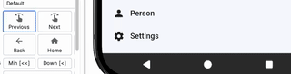
You can fix it by removing the `semanticLabel` from the `Icon` widget:
```dart
Row(
children: [
Icon(Icons.person),
Text('Person'),
],
)
```
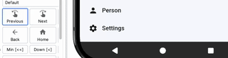
Now TalkBack reads "Person" once, and the icon is not focusable. Screen readers don't "see" it.
In cases like that, you should usually merge the label and the text into one accessibility node. So the entire row becomes focusable. But it's not the topic of this part. You can read more about that in [Part 1](https://www.thedroidsonroids.com/blog/flutter-accessibility-guide-part-1#Cross-platform_grouping_concepts).
### Pruning Subtrees with ExcludeSemantics
Take a standard contacts row: a `CircleAvatar` showing the first initial, and a `Text` with the full name beside it. Look at the code:
```dart
Row(
children: [
CircleAvatar(
child: Text('A'),
),
Text('Alice'),
],
)
```
And the video: 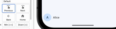
You haven't added any accessibility properties anywhere. But `Text` is always in the accessibility tree by default. The one inside the avatar too. TalkBack focuses on "capital A" first, then on "Alice." Announcing the initial doesn't make sense if there's a name right after it. For blind users it's noise.
The fix is to wrap `ExcludeSemantics` around the circle avatar. It removes the initial from the accessibility tree.
```dart
Row(
children: [
ExcludeSemantics(
child: CircleAvatar(
child: Text('A'),
),
),
Text('Alice'),
],
)
```
Here's how it looks on a device: 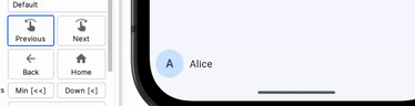
TalkBack reads only "Alice." The same rule applies to any widget that generates semantic nodes you don't need — a decorative badge, a watermark, and so on.
In a real list you'd also wrap the row in `MergeSemantics` so the entire item becomes one node. That's already covered in [Part 1](https://www.thedroidsonroids.com/blog/flutter-accessibility-guide-part-1#Cross-platform_grouping_concepts).
There's also shorthand you may want to know about: `Semantics(excludeSemantics: true)`. It excludes all children just like `ExcludeSemantics`. But it lets you set the semantic properties on the container itself. For example, you may add a label.
### Blocking What's Behind: BlockSemantics
Flutter also provides [`BlockSemantics`](https://api.flutter.dev/flutter/widgets/BlockSemantics-class.html). It's for a different problem. `ExcludeSemantics` removes a subtree's *own children* from the accessibility tree. `BlockSemantics` hides *sibling* nodes rendered *before* it. Think of it as a semantic curtain — everything painted behind the `BlockSemantics` widget disappears from the screen reader's view.
Think of a custom loading overlay. You have a list of items, the user taps "Sync," and a semi-transparent scrim with a spinner appears. You built it with a `Stack` — no `showDialog`, no `ModalBarrier`. Without `BlockSemantics`, a screen reader user can still swipe through every list item underneath the scrim. They hear content they can't interact with. Not a good experience.
Here's how you do it:
```dart
Stack(
children: [
ListView(
children: [
ListTile(title: Text('Item 1')),
ListTile(title: Text('Item 2')),
ListTile(title: Text('Item 3')),
],
),
BlockSemantics(
child: Container(
color: Colors.black54,
alignment: Alignment.center,
child: Semantics(
label: 'Syncing',
child: CircularProgressIndicator(),
),
),
),
],
)
```
`BlockSemantics` drops every sibling painted before it from the accessibility tree. TalkBack and VoiceOver only see "Syncing." The list items are not reachable by screen readers. Here's the screencast: 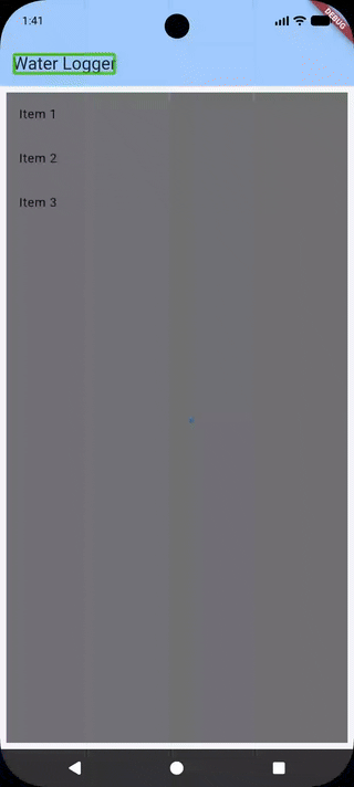
You won't need this for standard dialogs or bottom sheets. Flutter has a built-in [`ModalBarrier`](https://api.flutter.dev/flutter/widgets/ModalBarrier-class.html). It's out of the box in [`showDialog`](https://api.flutter.dev/flutter/material/showDialog.html) and [`showModalBottomSheet`](https://api.flutter.dev/flutter/material/showModalBottomSheet.html). The [`BlockSemantics`](https://api.flutter.dev/flutter/widgets/BlockSemantics-class.html) widget also has a `blocking` property (defaults to `true`). You can change it dynamically if you need to turn the curtain on and off based on state.
### Cross-platform Comparison
In SwiftUI, you can use [`.accessibilityHidden(true)`](https://developer.apple.com/documentation/swiftui/view/accessibilityhidden(_:)) to hide a view and its children from the accessibility tree. In Jetpack Compose, there is a [`clearAndSetSemantics { }`](https://developer.android.com/reference/kotlin/androidx/compose/ui/semantics/package-summary#(androidx.compose.ui.Modifier).clearAndSetSemantics(kotlin.Function1)) for that.
### Custom Semantic Actions — Giving Screen Readers a Gesture Vocabulary
A sighted user can perform a swipe gesture. A screen reader user can't do that. You have to provide alternatives to complex gestures — swipe-to-dismiss, long-press menus, drag-and-drop.
One of the simplest options is to add a custom action. You expose them with `customSemanticsActions` on the `Semantics` widget:
```dart
Semantics(
customSemanticsActions: <CustomSemanticsAction, VoidCallback>{
CustomSemanticsAction(label: 'Delete'): () {
// TODO: delete the entry
},
},
child: ListTile(
title: Text('Item'),
),
)
```
Each [`CustomSemanticsAction`](https://api.flutter.dev/flutter/semantics/CustomSemanticsAction-class.html) gets a label and a callback. TalkBack presents these labels in its actions menu. It also announces that actions are available.
On Android, you can swipe up then down. On iOS, select "Actions" in the rotor, then swipe down. Look at the screencast: 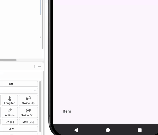
#### Cross-platform: Custom Actions on Native
In Jetpack Compose, you can add custom actions through the `semantics` modifier and [`customActions`](https://developer.android.com/reference/kotlin/androidx/compose/ui/semantics/SemanticsPropertyReceiver#(androidx.compose.ui.semantics.SemanticsPropertyReceiver).customActions()) property. In SwiftUI, you use [`.accessibilityAction(named:)`](https://developer.apple.com/documentation/swiftui/view/accessibilityaction(named:_:)-4nvf2). All three frameworks follow the same idea of callbacks and labels.
### Live Regions
Consider the following code snippet. It's a simple counter with increment and decrement buttons:
```dart
Row(
children: [
TextButton(
onPressed: () => setState(() => _count--),
child: Text('−'),
),
Text('$_count'),
TextButton(
onPressed: () => setState(() => _count++),
child: Text('+'),
),
],
)
```
At first glance, it looks fine. The buttons work. Screen readers announce: "Button, minus. Double-tap to activate," the number, and the plus button analogously.
If you can see the screen, you can watch the number change when you tap the buttons. But if you don't see anything, and you're using a screen reader only,
you don't know what the current value is. You need to move the accessibility focus back and forth between the buttons and the number to adjust the counter to the value you want.
Look at the screencast:  — an element that updates dynamically. Assistive technology announces it without the user moving focus there.
Flutter also supports [live regions](https://api.flutter.dev/flutter/semantics/SemanticsProperties/liveRegion.html). To make a widget announce its value, wrap it in `Semantics(liveRegion: true)`:
```dart
Row(
children: [
TextButton(
onPressed: () => setState(() => _count--),
child: Text('−'),
),
Semantics(liveRegion: true, child: Text('$_count')),
TextButton(
onPressed: () => setState(() => _count++),
child: Text('+'),
),
],
),
```
When `_count` changes and `Text` rebuilds, the app announces it. See it in action: 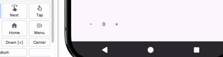
Look at the text of the first button. You may think it's a `-` that you can find on the standard keyboard next to the `+` key. Nothing could be further from the truth.
If it was `-`, a [hyphen minus](https://www.compart.com/en/unicode/U+002D), screen readers would have announced it differently.
For example, TalkBack says "Dash": 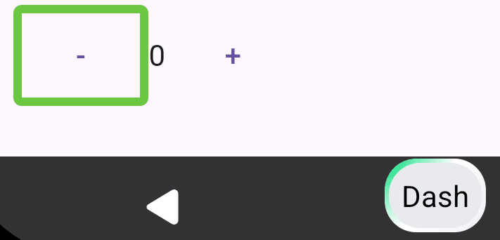
And VoiceOver says "hyphen.": 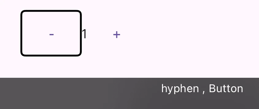
Note that the exact results may vary depending on the screen reader (e.g., Samsung provides its own TalkBack) and the language. The correct character for a decrement button is a `−`, [minus sign](https://www.compart.com/en/unicode/U+2212) — a mathematical symbol.
The screen readers on both platforms announce it correctly as "minus." Note that string interpolation `$_count` isn't a good way to display numbers in the UI. You should use a [NumberFormat](https://api.flutter.dev/flutter/package-intl_intl/NumberFormat-class.html) instead. In the snippet, number formatting is omitted for brevity.
### What You've Achieved
`ExcludeSemantics` removes redundant nodes from the accessibility tree. It applies to its entire subtree. `BlockSemantics` also removes nodes, but it targets siblings instead. `customSemanticsActions` gives screen reader users alternatives to gestures and other direct touch interactions. And `Semantics(liveRegion: true)` makes dynamic content announce itself when it changes.
In the next part you'll build a fully accessible custom widget from scratch — label, value, and actions. You'll also learn about semantic flags and roles. See you there!
Comments
More Blog
View allkubernetesMinimalist EKS: The Easy Way
Amazon EKS manages the Kubernetes control plane, but you remain responsible for provisioning the...
J
Joaquin MenchacaaiNever forget to enter the Stern Grove lottery again!
Browser automation with Playwright, Python, GitHub Actions, and Entire to auto-enter San Francisco Stern Grove concert lotteries each week!
L
Lizzie SiegletypescriptA Free Screenshot Editor That Never Uploads Your Image
A free screenshot and image editor that runs entirely in your browser. Keeping every edit reversible and handling big phone photos, in plain TypeScript and Canvas2D.
M
Martin StarkshowdevI built a CLI to break my highlights out of Apple Books
A macOS CLI + MCP server that exports Apple Books highlights to Markdown and gives AI assistants direct access to your reading notes.
A
Andrey KorchakaiA Developer's Guide to Agent Hooks in Antigravity CLI
Motivation To be quite honest, "Hooks"—the shell commands we trigger at specific points...
T
TanaikeagentsTactical vs. Strategic Agentic AI Development — A Playbook for Developers
The Strategic Engineer: Why Writing Code Is No Longer Your Most Valuable Skill ...
A
Adewumi Saheed Adewale