 Grok
GrokBack to Blog css
css ai
ai docker
 opensource
 azurefabric
 googlecloudplatform
 iac
iac
Flexible Border Element
Lisa Cee March 1, 2026
0 views
I recently transitioned from full stack to front end engineer. Front end is what inspired me to...
I recently transitioned from full stack to front end engineer. Front end is what inspired me to become an engineer and returning to a front end focus has reinvigorated my desire to play with code in my free time. I picked a project on Frontend Mentor and have been building it out on the weekends.
Here is what I am building:

It was going really well; I was building out components, implementing theming and familiarizing myself with Tailwind when I got stumped by the card border.
Border Issues
I already knew that it could be challenging working linear-gradient borders, so I decided to wait on the Instagram card and focus on the solid color borders. It was easy to add a top border to a card with a border-radius, but it didn’t look like the design. The border had a curve on the corner that I didn’t like.
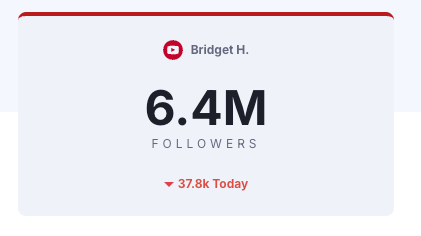
<div className="rounded-lg border-t-4 border-red-700 flex flex-col items-center gap-6 bg-card py-6 w-[300px]"
    >
    {/* Card content */}
</div>
Rather than stalling my progress by figuring this out, I opted to move on to the Instagram border which ended up providing a solution for both the curved border corners and the gradient border.
Gradient Border
To create the gradient border for the Instagram card, I started with some conditionally logic. If the component was the Instagram card, then conditionally render either a border or a border-image.
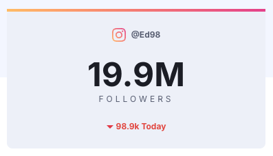
<div
     className={`rounded-lg border-t-4 ${!isInstagram ? 'border-red-700' : ''} flex flex-col items-center gap-6 bg-card py-6 w-[300px] md:p-6 md:w-full cursor-pointer`}
     style={
        isInstagram
          ? {
          borderRadius: '8px',
          borderImage:
                'linear-gradient(to right, hsl(37, 97%, 70%), hsl(5, 77%, 71%), hsl(329, 70%, 58%)) 1',
            }
          : undefined
      }
>
       {/* Card content */}
</div>
This worked to a point, but I didn't love it. First, I didn’t like the complexity of adding a border for some cards and a border-image to others. I also didn’t like using the inline style tag. Finally, and most importantly, a border-image does not work with border-radius. That was a deal breaker.
The Aha! Moment
As I searched for a solution, I learned that there are a lot of ways to solve for this issue. The cleanest way that I found was to create a css class for the border with a relative position. Then I created a pseudo element using ::before to create an absolutely positioned border with a border radius.
<div className={`rounded-lg  ${!isInstagram ? 'service-border' : 'border-red-700 border-t-4' } flex flex-col items-center gap-6 bg-card py-6 w-[300px] md:p-6 md:w-full cursor-pointer`}
>
     {/* Card content */}
</div>

{/* CSS */}
.service-border {
  position: relative;
}

.service-border:before {
  content: '';
  position: absolute;
  top: -4px;
  left: 0;
  right: 0;
  height: 4px;
  border-radius: 0.5rem 0.5rem 0 0;
  background: linear-gradient(to right, hsl(37, 97%, 70%), hsl(5, 77%, 71%), hsl(329, 70%, 58%));
}
That is where I had the aha moment and discovered that I could solve both of my issues using a pseudo-element. I could have a gradient border with a radius and solve the curved corner issue with the solid-color borders.
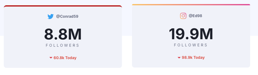
Since I was already going to be using some vanilla CSS, I opted to add a dynamic border class based on the service name.
<div className={`rounded-b-lg service-border border-${serviceName} flex flex-col items-center gap-6 bg-card py-6 w-[300px] md:p-6 md:w-full cursor-pointer`}
>
     {/* Card content */}
</div>

{/* CSS */}
.service-border {
  position: relative;
}

.service-border:before {
  content: '';
  position: absolute;
  top: -4px;
  left: 0;
  right: 0;
  height: 4px;
  border-radius: 0.5rem 0.5rem 0 0;
}

.border-facebook::before {
  background: hsl(var(--facebook-border));
}

.border-twitter::before {
  background: hsl(var(--twitter-border));
}

.border-youtube::before {
  background: hsl(var(--youtube-border))
}

.border-instagram::before {
  background: linear-gradient(to right, hsl(37, 97%, 70%), hsl(5, 77%, 71%), hsl(329, 70%, 58%));
}

It is still a work in progress, but I was pleasantly surprised by discovering this solution that worked well for both of my border-related challenges. You can check out the WIP project on my GitHub. I'd love to hear your thoughts and your go-to solutions on how to handle CSS border gotchas.
TL;DR
You can create a more flexible border by creating an absolutely-positioned pseudo-element. It provides a nice, flat border, can handle both solid colors and gradients and can accommodate a border-radius.
Comments
More Blog
View allaiSkills Are the New CLI
Every developer tool follows the same pattern: parse flags, run logic, print output. git commit -m...
H
Helder Burato Berto 1
dockerDuct tape enough services together and you can cache APT packages
APT repositories are just HTTP file servers, doesn't seem like something that should require a custom piece of software.
D
Devin H 1
opensourceHow We Use AWS CDK to Deploy OpenClaw for Enterprise Teams — API Key Management Without the Chaos
We wanted every employee in the company to use OpenClaw — not just engineers. Product managers...
C
C.K.SunazurefabricMCP Development with Python, and Azure Fabric
Leveraging Gemini CLI and the underlying Gemini LLM to build Model Context Protocol (MCP) AI...
X
xbillgooglecloudplatformMCP Development with Gemini CLI, Python, and Azure Functions
Leveraging Gemini CLI and the underlying Gemini LLM to build Model Context Protocol (MCP) AI...
X
xbilliacMCP Development with Python, and the Azure Container Instance
Leveraging Gemini CLI and the underlying Gemini LLM to build Model Context Protocol (MCP) AI...
X
xbill 2
Ready-made automations for this
Workflows from the Neura Market marketplace related to this Grok resource
- Extract Text from Images & PDFs via Telegram with Mistral OCR to Markdownn8n · $24.99 · Related topic
- Microsoft Outlook AI Email Assistant with Contact Support from Monday and Airtablen8n · $14.99 · Related topic
- Cold Email Icebreakers from Local Business Search with GPT-4 and Dumpling AIn8n · $9.99 · Related topic
- Extract Business Leads from Google Maps with Dumpling AI to Google Sheetsn8n · $4.99 · Related topic