Back to Blog discuss
 ai
ai ai
ai ai
ai go
go playwright
 cli
cli
Implemented a Feature where the Theme on my Portfolio changes based on the Holiday (Because it's fun) 💫
FrancisTRᴅᴇᴠ (っ◔◡◔)っ February 9, 2026
0 views
Yesterday, I had this great idea for my portfolio. I want to implement a feature where if it reaches...
Yesterday, I had this great idea for my portfolio. I want to implement a feature where if it reaches Valentine day (since it is coming up), it changes the theme of my portfolio. For example, right now I have blue for my text. Instead, it would be pink!
Of course, hard coding it would be a pain since you have to manually change it on each holiday, so I made it automatically using the `new Date()`. The holidays I added are:
- Valentine Day
- St. Patrick's Day
- Halloween
- Christmas Day
Here are the features I added to the portfolio! If you would love to see it, visit: https://francistr.github.io/
---
## Spark Effect on Mouse Click!
I found this effect from Prahalad on this post ["Click anywhere to see Spark Effect(fireworks) using CSS and JS"](https://dev.to/prahalad/click-anywhere-to-see-spark-effectfireworks-using-css-and-js-20fn). The only problem is translating it to my Portfolio since I used Next.js for my Portfolio. To achieved the functionality, here is what I did:
In CSS (Similar to Prahalad implementation):
```
/* Each spark segment */
.click-burst li {
padding: 0;
width: 0;
height: 0;
position: absolute;
left: auto;
right: auto;
}
/* Top (vertical) */
.click-burst li:first-child {
left: 50%;
top: -22px;
width: 1px;
border-left: 2px solid var(--click-color-1);
animation: vert 0.25s linear;
}
/* Bottom (vertical) */
.click-burst li:nth-child(2) {
left: 50%;
bottom: -22px;
width: 1px;
border-left: 2px solid var(--click-color-1);
animation: vert 0.25s linear;
}
/* Left (horizontal) */
.click-burst li:nth-child(3) {
left: -6px;
top: 11px;
height: 1px;
border-bottom: 2px solid var(--click-color-1);
animation: horiz 0.25s linear;
}
/* Right (horizontal) */
.click-burst li:nth-child(4) {
right: -6px;
top: 11px;
height: 1px;
border-bottom: 2px solid var(--click-color-1);
animation: horiz 0.25s linear;
}
/* Diagonals */
.click-burst li:nth-child(5) {
left: 0px;
top: -11px;
rotate: 45deg;
height: 1px;
border-bottom: 2px solid var(--click-color-2);
animation: horiz 0.25s linear;
}
.click-burst li:nth-child(6) {
right: 0px;
top: -11px;
rotate: -45deg;
height: 1px;
border-bottom: 2px solid var(--click-color-2);
animation: horiz 0.25s linear;
}
.click-burst li:nth-child(7) {
left: 0px;
bottom: -11px;
rotate: -45deg;
height: 1px;
border-bottom: 2px solid var(--click-color-2);
animation: horiz 0.25s linear;
}
.click-burst li:nth-child(8) {
right: 0px;
bottom: -11px;
rotate: 45deg;
height: 1px;
border-bottom: 2px solid var(--click-color-2);
animation: horiz 0.25s linear;
}
/* Keyframes for mouse click */
@keyframes vert {
from { height: 22px; }
to { height: 0px; }
}
@keyframes horiz {
from { width: 22px; }
to { width: 0px; }
}
```
On the ClickBurst.tsx, I add this code:
```
/**
* Click anywhere on the page to spawn a temporary <ul> with 8 <li> "sparks"
* positioned and animated by CSS. Removed after 250ms.
*/
export default function ClickBurst() {
useEffect(() => {
const onClick = (event: MouseEvent) => {
let ul = document.createElement("ul");
ul.className = "click-burst";
// Absolutely position at the mouse and center the UL on that point
ul.style.position = "absolute";
ul.style.left = `${event.pageX}px`;
ul.style.top = `${event.pageY}px`;
ul.style.transform = "translate(-50%, -50%)";
// Size of the effect area (tweak as you like)
ul.style.width = "3em";
ul.style.height = "1.5em";
// Housekeeping
ul.style.listStyle = "none";
ul.style.padding = "0";
ul.style.margin = "0"; // no margin hacks needed
ul.style.pointerEvents = "none"; // don't block clicks
ul.style.zIndex = "9999"; // on top of everything
// 8 radial “spark” lines (li elements)
for (let i = 1; i <= 8; i++) {
let li = document.createElement("li");
ul.appendChild(li);
}
document.body.appendChild(ul);
// Remove after 250ms (matches animation duration)
setTimeout(() => {
ul.remove();
}, 250);
};
document.body.addEventListener("click", onClick);
return () => document.body.removeEventListener("click", onClick);
}, []);
return null; // no visible UI; this just wires up the effect
}
```
_Note that I had the help of Copilot to translate the code from the post onto my portfolio. Tweaks were made after translation._
Annnnndddddddd Done! Those are the main parts. Here is what it looks like:
## Hovering Effect!
When you hover over my title "Full-Stack AI Engineer", your mouse change to a different .ico image. For some reason, it did not like .png .jpg, etc. So, I made my disired images all .ico. This is what I added.
For CSS, I added a variable and add that variable to our class:
```
/* Inside of the Root */
--custom-cursor: url('/cursorImg/IceCream.ico') 16 16, auto
/* Outside of the Root */
.custom-cursor {
cursor: var(--custom-cursor);
}
```
Then I added the `<span>` tag that only works if you hover over this text
```
<h2 className="text-2xl lg:text-start shiny">
<span className="custom-cursor">Full-Stack AI Engineer</span>
</h2>
```
That's pretty much it. Here is what it looks like when you visit my site!
## Rest of page change colors!
To achieve this, this is the steps I took to make this dynamic.
For CSS, I create the variables in the root and use it throughout the CSS file:
```
:root {
/* Titles */
--shiny-color: #00ccff;
--shiny-color-light: #cef5ff;
/* sub-titles */
--primary-main-color: 193 100% 50%;
/* Card itself */
--card-main-bg: 222.2 50% 10%;
/* Skills card */
--skills-card-bg: #0C1426;
/* Click colors */
--click-color-1: rgb(255, 255, 255);
--click-color-2: rgb(255, 255, 255);
--custom-cursor: url('/cursorImg/IceCream.ico') 16 16, auto
}
```
I then added a .tsx file called "ThemeScheduler". where it's purpose is if the assign date has started, change the variable values to a different color.
For example, for Christmas, we assign the colors and its date of change:
```
{ // Christmas (December 25th)
// Year, Month, day, hours, minutes, seconds, milliseconds
start: new Date(new Date().getFullYear(), 11, 25, 0, 0, 0, 0),
end: new Date(new Date().getFullYear(), 11, 26, 0, 0, 0, 0),
vars: {
"--shiny-color": "hsl(120, 79%, 40%)",
"--shiny-color-light": "#ff7a7a",
"--primary-main-color": "120, 79%, 40%",
"--card-main-bg": "0, 49%, 10%",
"--skills-card-bg": "hsl(0, 49%, 10%)",
"--click-color-1": "rgb(21, 183, 21)",
"--click-color-2": "rgb(255, 122, 122)",
"--custom-cursor": "url('/cursorImg/ChristmasTree.ico') 16 16, auto"
},
},
```
That is the gist of it. Here is what it looks like for each holiday in full:
#### Valentine Day
#### St. Patrick's Day
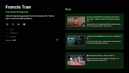
#### Halloween
#### Christmas Day
---
Thanks for reading! Note that the Portfolio is still in the works. If you would love to review and provide feedback, I would love to hear from you! Will make a Portfolio review request in the future!
# Discussion
- What other themes should I add?
- What is your favorite theme?
- Feedback would be nice! Note that this is still in development, but would love to receive feedback if possible!
Comments
More Blog
View allaiHow I'm using ASTs and Gemini to solve the "Codebase Onboarding" problem 🧠
Hi everyone! 👋 I’m Tara, a Senior Software Engineer and Consultant. Over the years, I've jumped...
T
tworrellaiLocal AI Will Save Us All (The Math Says So, Trust Me)
Every few weeks a take goes viral in tech circles making the case for ditching cloud AI and running...
S
Sebastian SchürmannaiLost in the AI Hype, I Started Small
And it helped me get back into tech without drowning TL;DR at the end Coming back to...
R
Rohini GaonkargoBuilding a Replay-Tested Interactive Brokers Client in Go
I wanted an IBKR library that felt like Go and had testing I could trust. So I wrote one.
T
Thomas MarcelisplaywrightPlaywright in Pictures: Fully Parallel Mode
Playwright’s fullyParallel mode is often treated as a simple performance switch. In practice, it...
V
Vitaliy PotapovcliDesigning a CLI for Both Humans and Agents
Learn how Alpic designed its CLI for both human developers and AI agents — covering tradeoffs like polling, context windows, interactivity, and statelessness.
J
Julien Vallini