Back to Blog frontend
The Solution:
 gemma
gemma community
 ai
ai ai
ai githubactions
 ai
ai
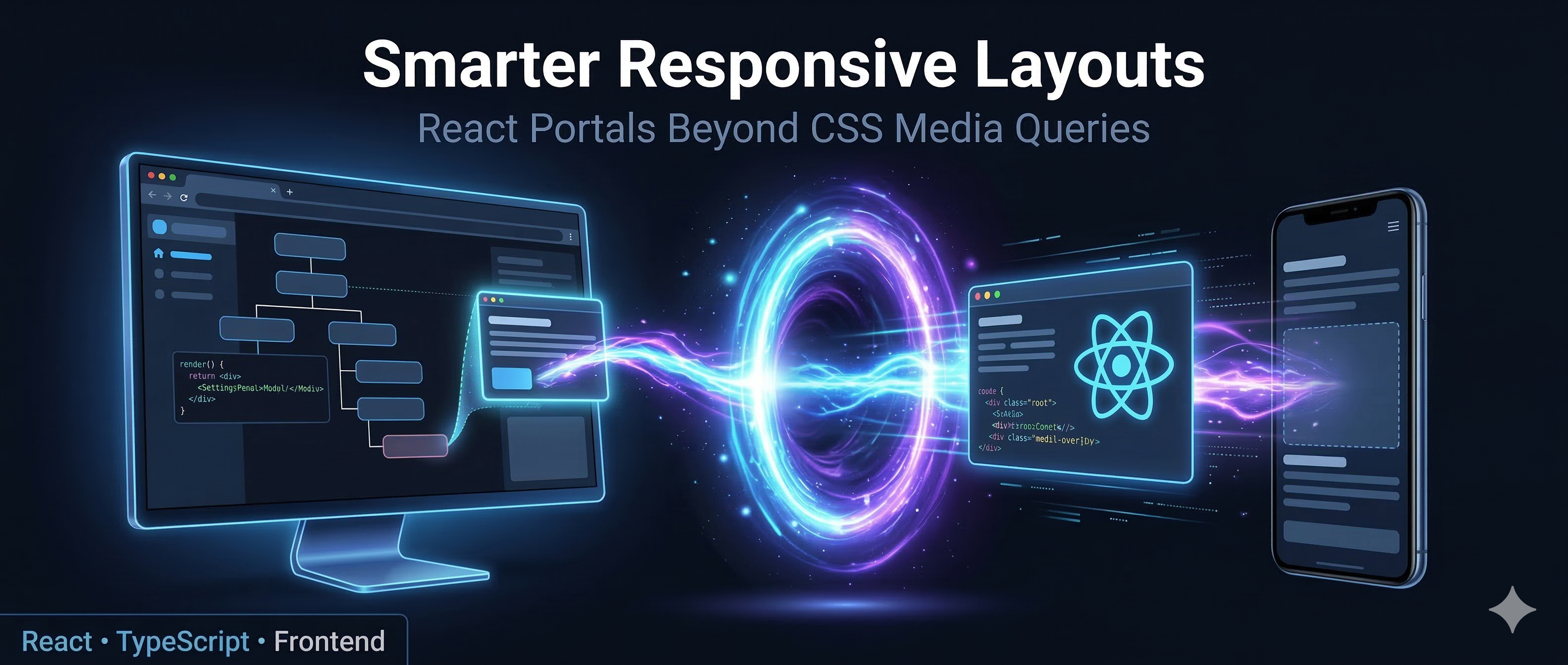
How I Moved a React Component Across the DOM Without Losing Its State — A Checkout Story
Satish Gowda March 23, 2026
0 views
How I used React Portals and JavaScript media queries to solve a real-world layout problem on a...
title: How I Moved a React Component Across the DOM Without Losing Its State — A Checkout Story published: true description: tags:
cover_image: https://dev-to-uploads.s3.amazonaws.com/uploads/articles/ysfw8a3a1f8l2b9dhjbt.png
Use a ratio of 100:42 for best results.
published_at: 2026-03-23 05:44 +0000

How I used React Portals and JavaScript media queries to solve a real-world layout problem on a checkout page
The Problem Nobody Warns You About
You're building a checkout page. On desktop, you have the classic Holy Grail layout, a wide left column with the main form content and a right sidebar with supporting information. Your designer places a coupon/offers component in that right sidebar. Clean. Elegant. Makes sense.
Then you open the mobile view.
That right sidebar? Gone, because it collapses into a linear single-column layout on smaller screens. The coupon component now needs to live somewhere in the middle of the left column's content flow on mobile. Not at the bottom. Not at the top. Somewhere specific, visible to the user in the first fold.
And here's where it gets messier than just "desktop vs mobile." These UI decisions aren't just about two breakpoints. A tablet in portrait mode behaves like a mobile device — single column, linear flow. Rotate it to landscape and suddenly it's desktop territory sidebar back, Holy Grail restored. Same device, same user, two completely different layout expectations within seconds.
This is where CSS display: none / display: block tricks fall apart. You could render the component twice — once for landscape (desktop) and once for portrait (mobile) — and toggle visibility. But now you have two instances of the same component, two sets of state, two API connections, and a maintenance headache.
There had to be a better way.
What Are React Portals?
React Portals let you render a component's output into any DOM node you choose, even one that exists completely outside your component's parent hierarchy while maintaining the state from the parent component.
import { createPortal } from 'react-dom';

const MyComponent = () => {
  return createPortal(
    <div className="modal">Hello from a portal!</div>,
    document.body
  );
};
Portals are typically used for modals, tooltips, and dropdowns. Cases where you need to escape a parent's overflow: hidden or z-index stacking context. But they're capable of a lot more.
The key insight: while the DOM node is placed elsewhere, the React component tree and all its state stays intact. One component instance, one state, rendered wherever you need it.
The Solution: PortComponent
The idea is straightforward, Build a wrapper component that:
- Accepts two DOM target selectors, one for desktop and one for mobile.
- Listens to the viewport width using a JavaScript media query.
- Uses
createPortalto teleport the child component to the correct target.
import { ReactElement, useEffect, useRef } from "react";
import { createPortal } from "react-dom";
import { useMediaQuery } from "react-responsive";

interface PortComponentProps {
  deskElem: string;      // CSS selector for the desktop target container
  mobElem: string;       // CSS selector for the mobile target container
  Component: ReactElement;
}

const PortComponent = ({ deskElem, mobElem, Component }: PortComponentProps) => {
  const isDesktop = useMediaQuery({ query: "(min-width: 1024px)" });

  const elem = useRef<HTMLDivElement>(document.createElement("div"));

  useEffect(() => {
    if (isDesktop) {
      document.querySelector(deskElem)?.appendChild(elem.current);
    } else {
      document.querySelector(mobElem)?.appendChild(elem.current);
    }
  }, [isDesktop, deskElem, mobElem]);

  return createPortal(Component, elem.current);
};

export default PortComponent;
And here is how it looks at the call site:
<PortComponent
  deskElem="#deskElem"
  mobElem="#mobileElem"
  Component={createElement(CouponWidget, {
    onCouponApplied: () => refetchPaymentMode(),
    coupons: couponList,
  })}
/>
Breaking Down the Magic
useMediaQuery, Reactive Viewport Detection
const isDesktop = useMediaQuery({ query: "(min-width: 1024px)" });
From the react-responsive library, this isn't a one-time check, it subscribes to a MediaQueryList event listener under the hood. When the viewport crosses 1024px, isDesktop flips, the component re-renders, and the useEffect fires again. The component responds to layout changes in real time.
useRef for the Portal Host
const elem = useRef<HTMLDivElement>(document.createElement("div"));
This creates a plain <div> that acts as the portal's mounting point. Using useRef means it's created once and persists across renders. Moving it between DOM containers doesn't destroy or recreate it — and crucially, the React component tree inside it (state, API calls, everything) stays completely alive. We're moving the container, not remounting the component.
useEffect — The DOM Transplant
useEffect(() => {
  if (isDesktop) {
    document.querySelector(deskElem)?.appendChild(elem.current);
  } else {
    document.querySelector(mobElem)?.appendChild(elem.current);
  }
}, [isDesktop, deskElem, mobElem]);
appendChild on a node that already exists in the DOM moves it, it doesn't clone it. The browser handles the transplant natively, and React's virtual DOM stays consistent because createPortal always points to the same elem.current ref.
The Target Containers in Your Layout
You need placeholder elements in your JSX to serve as anchor points:
// Desktop layout (right sidebar)
<aside className="checkout-sidebar">
  <div id="deskElem" />       {/* Coupon component lands here on desktop */}
  <PriceDetails />
  <OrderSummary />
</aside>

// Mobile layout (main content column)
<main className="checkout-main">
  <ShippingAddress />
  <BillingAddress />
  <div id="mobileElem" />     {/* Coupon component lands here on mobile */}
  <WalletSection />
  <PaymentMethods />
</main>
These empty divs are invisible in themselves but act as precise positional anchors for the teleporting component.
Why Not Just Use CSS?
You could render two instances and toggle with CSS:
.coupon-desktop { display: none; }
.coupon-mobile  { display: block; }

@media (min-width: 1024px) {
  .coupon-desktop { display: block; }
  .coupon-mobile  { display: none; }
}
For a stateless display component, that's perfectly fine. But this approach has a deeper problem that goes beyond just API calls — it doesn't preserve state.
Imagine a user on a tablet who rotates their device mid-session. The coupon they just applied? Gone! because the hidden instance was never in sync. The input they half-typed into a promo code field? Cleared. Any loading or error state? Lost. When you toggle between two separate component instances, each one has its own isolated React state. There's no shared memory between them. Whichever one was hidden was effectively dead.
{/* Both mount independently, both have their own state */}
<div className="coupon-desktop">
  <CouponWidget /> {/* State lives here — applied coupon, input value, loading */}
</div>
<div className="coupon-mobile">
  <CouponWidget /> {/* Completely separate state — knows nothing about the above */}
</div>
Beyond state, two instances also means double the API calls on mount, synchronisation problems if one instance triggers a side effect, and twice as much to maintain when the component logic changes.
The Portal approach sidesteps all of this. There is only ever one instance of the component in memory. Its state is never destroyed when the layout shifts — the component physically moves to a new DOM location, but React keeps its internal state, refs, and context connections completely intact. The user's applied coupon, their half-typed promo code, any in-flight API request — all of it survives a breakpoint change seamlessly.
That's the real win: one instance, one state, one source of truth — displayed wherever the layout demands.
Potential Improvements
This pattern works well in production, but here are a few things worth considering for a more robust version:
Cleanup on unmount: The current implementation doesn't remove elem.current from the DOM when the component unmounts:
useEffect(() => {
  const target = document.querySelector(isDesktop ? deskElem : mobElem);
  target?.appendChild(elem.current);
  return () => { elem.current.remove(); };
}, [isDesktop, deskElem, mobElem]);
SSR compatibility: document.createElement runs at initialisation time, which will throw in server-side rendering environments like Next.js. A useEffect-based setup would be needed there.
Configurable breakpoint: Externalising 1024px as a prop makes PortComponent reusable across different layout breakpoints in the same project.
Takeaways
React Portals are often introduced as a tool for modals and dropdowns, but their real power is giving you precise control over where in the DOM your components live. Independent of where they sit in your component tree.
When combined with a reactive media query hook, you get a component that is genuinely layout-aware: it doesn't just look different at different screen sizes, it lives in a different place. That's a meaningful distinction for complex layouts like checkout pages, dashboards, or any UI that fundamentally restructures itself between breakpoints.
If you've been hacking around this with CSS display:none, there's a cleaner way — and your users will thank you.
In the next article, I'll show how I'd rewrite this today using Radix UI — and whether it's actually worth it.
Have you used React Portals in unconventional ways? Drop a comment — I'd love to hear about it.
Comments
More Blog
View allgemmaFive Gemma-4 models, one accelerator: what porting E2B 31B to AWS Inferentia2 taught me
I ported the whole Gemma-4 family — E2B, E4B, 12B, 31B, and the 26B-A4B MoE — to run on...
X
xbillcommunityHey DEV, I'm Tobore. Let's actually connect.
Hey DEV, I'm Tobore. Let's actually connect. I've been on here for a while now, mostly writing and...
L
Laurina AyarahaiI burned through thousands of AI tokens. Then a friend did it for free
(yep, kinda clickbait, just for the funsies 😊) At the beginning of the year, I relaunched my...
P
Paulo HenriqueaiClaude might be saturating your machine
My laptop was sitting idle with the fan at full tilt. Nothing was running that I knew of. The culprit...
S
Sidhant PandagithubactionsAutomated GitHub Code Reviews Using Google Gemini
I Built a Thing! TL;DR — Google Gemini-based Pull Request reviews and Issue Triaging for...
D
Darren "Dazbo" LesteraiWhat is an "agentic harness," actually?
I've been hearing the word "harness" thrown around a lot lately. I assumed it just meant "the IDE" or...
T
Tilde A. ThuriumReady-made automations for this
Workflows from the Neura Market marketplace related to this DeepSeek resource
- Automate Blog Content Creation with Notion MCP, DeepSeek AI, and WordPressn8n · $9.99 · Related topic
- Automate Language Model Queries with Custom JavaScript Agentsn8n · $9.99 · Related topic
- Generate AI Videos from Scripts with DeepSeek, Synthesia, and Together.ain8n · $24.99 · Related topic
- Compare Multi-Period Financial Data from Google Sheets with DeepSeek AI Analysisn8n · $14.99 · Related topic