
Back to Blog javascript
 ai
ai googlecloud
 discuss
 agents
 agenticarchitect
 ai
ai
Creating a Vertical Area Chart with JavaScript: 80+ Years of U.S. Presidential Approval Data
andreykh April 15, 2026
0 views
Traditionally, charts that visualize data over time are horizontal. But sometimes a vertical layout...
Traditionally, charts that visualize data over time are horizontal. But sometimes a vertical layout is a better fit. In this tutorial, you will learn how to create an interactive vertical area chart using JavaScript step by step.
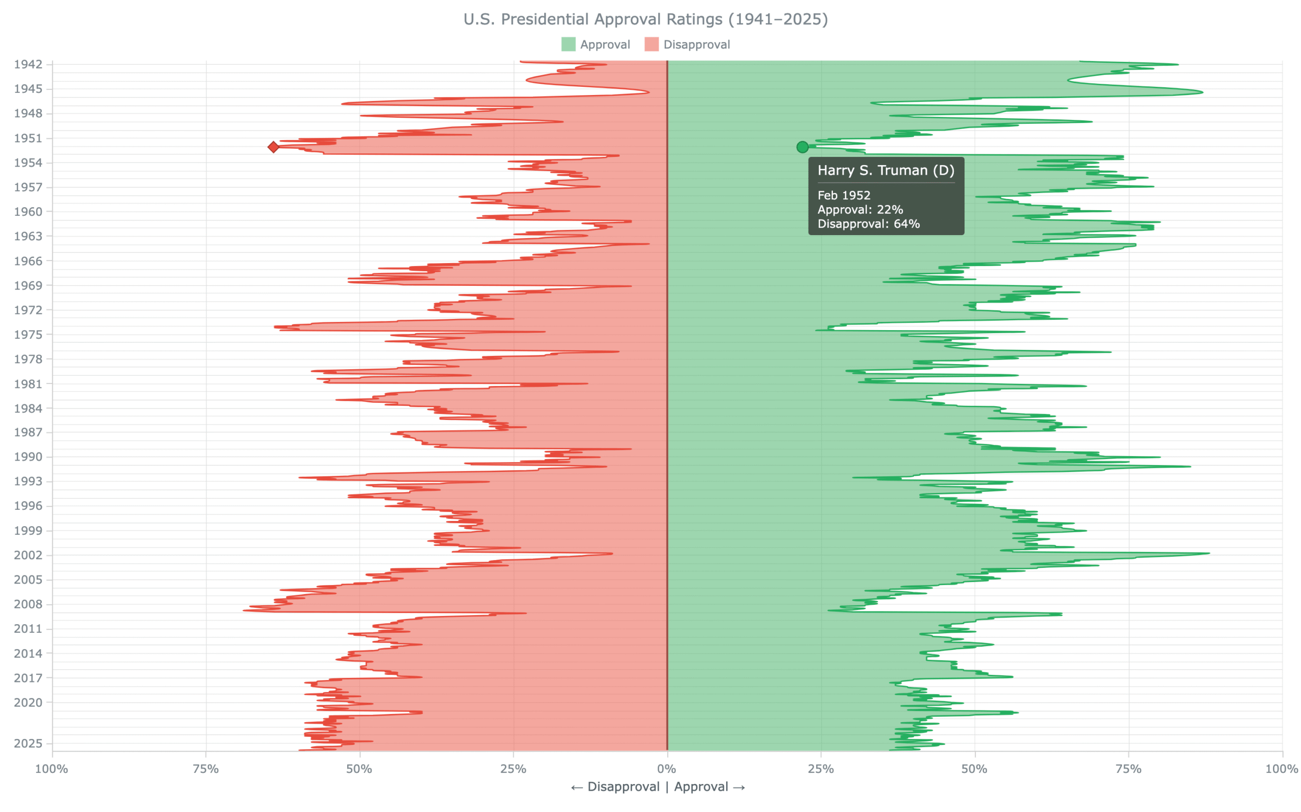
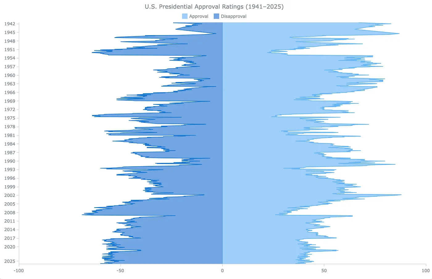
The practical example uses monthly approval and disapproval ratings of American presidents from 1941 to 2025, according to Gallup polls. The final chart shows over 80 years of public support and opposition across U.S. administrations as two mirrored area series running top to bottom.
The result will look like this:
What Is a Vertical Area Chart?
A vertical area chart is a type of data visualization that rotates a standard area chart 90 degrees. The time or category axis runs vertically, and the value axis runs horizontally. The filled area between the series line and the baseline still communicates magnitude and change — the orientation just shifts so that time flows top to bottom instead of left to right.
This layout works well in a few specific situations: when the timeline is long and a horizontal chart would compress the data too much, when category labels are long and hard to fit on a horizontal axis, or when the chart is embedded in a vertically scrolling page and a wide horizontal layout would interrupt the reading flow. It is also a natural choice when the main story is the balance between two opposing series.
How to Build a JavaScript Vertical Area Chart
Building an interactive vertical area chart with JavaScript involves four steps: creating the HTML page, loading the library, preparing the data, and writing the visualization code.
1. Create an HTML Page
Start with a minimal HTML file containing a <div> element that will hold the chart. The #container div is set to fill the full browser window here, but you can replace the percentage values with fixed pixel dimensions if the chart should occupy only part of a page.
<!DOCTYPE html>
<html lang="en">
<head>
  <meta charset="UTF-8">
  <meta name="viewport" content="width=device-width, initial-scale=1.0">
  <title>JavaScript Vertical Area Chart</title>
  <style>
    /* make the page and container fill the full browser window */
    html, body, #container {
      width: 100%;
      height: 100%;
      margin: 0;
      padding: 0;
    }
  </style>
</head>
<body>
  <!-- the chart will render inside this div -->
  <div id="container"></div>
</body>
</html>
Now that the HTML page is in place, let's add the charting library.
2. Include the JavaScript Files
In this tutorial, we will be using the AnyChart JavaScript charting library. The vertical area chart type is available in its anychart-base.min.js module. Load it from the AnyChart CDN by adding a <script> tag in the <head> section, then add an empty <script> block in the <body> where the chart code will go.
<head>
  ...
  <!-- load the AnyChart base module, which includes vertical area charts -->
  <script src="https://cdn.anychart.com/releases/8.14.1/js/anychart-base.min.js"></script>
</head>
<body>
  <div id="container"></div>
  <!-- chart code goes here -->
  <script>
  </script>
</body>
With the library loaded, the next step is to prepare the data.
3. Prepare the Data
The chart uses U.S. presidential job approval data from the American Presidency Project at UC Santa Barbara, based on Gallup polling results covering 16 presidents from Franklin D. Roosevelt to Donald Trump's second term. Monthly averages of approval and disapproval percentages were computed across all available polls for each month.
The dataset contains 910 monthly data points. Each row holds a month label, the average approval percentage, and the average disapproval percentage stored as a negative number. Storing disapproval as negative creates the mirrored effect around the zero baseline — the technique that gives this chart its distinctive shape. Here is a sample of the data:
| Month | Approval (%) | Disapproval (stored as negative %) |
|---|---|---|
| Jul 1941 | 67 | -24 |
| Jan 1953 | 68 | -8 |
| Jan 1961 | 72 | -6 |
| Oct 2001 | 88 | -9 |
| Jul 1974 | 24 | -63 |
| Jan 2009 | 56 | -31 |
| Jan 2021 | 46 | -50 |
| Dec 2025 | 36 | -59 |
Each row is a three-element array: the month label string, the approval value, and the disapproval value, and it looks like this in the code:
// each entry: [month label, approval %, disapproval as negative %]
// the full dataset has 910 rows; the complete version is in the Playground link below
const rawData = [
  ["Jul 1941", 67, -24],
  ["Aug 1941", 67, -24],
  ["Sep 1941", 70, -24],
  // ... 907 more monthly entries ...
  ["Dec 2025", 36, -59]
];
4. Write the JS Code for the Chart
All the JavaScript goes inside an anychart.onDocumentReady() wrapper — a function that AnyChart calls as soon as the page has fully loaded. This guarantees that the chart container <div> exists in the DOM before the chart tries to render into it.
anychart.onDocumentReady(function () {

  // all chart code goes here

});
Add the Data
The rawData array from Step 3 is the first thing to place inside anychart.onDocumentReady().
The time axis will use a date/time scale, which requires JavaScript Date objects rather than strings like "Jul 1941". Each row is therefore needs to be converted before passing it into the chart.
MONTH_IDX is a small lookup object that maps three-letter month abbreviations to their zero-based index — January = 0, December = 11 — matching the Date constructor.
// map month abbreviations to their zero-based JS Date index
const MONTH_IDX = {
  Jan:0, Feb:1, Mar:2, Apr:3, May:4,  Jun:5,
  Jul:6, Aug:7, Sep:8, Oct:9, Nov:10, Dec:11
};

// convert each "MMM YYYY" string to a Date object, keep the approval and disapproval values
const data = rawData.map(function(row) {
  const parts = row[0].split(" ");
  return [new Date(parseInt(parts[1]), MONTH_IDX[parts[0]], 1), row[1], row[2]];
});
Create a Data Set and Map the Two Series
AnyChart uses a data set as a single source that can feed multiple series at once. We load all 910 rows into one with anychart.data.set(), then create two mappings from it. approvalMap reads column 1 as the series value; disapprovalMap reads column 2. Both share column 0 — the Date object — as their x position.
// load the data into an AnyChart data set
const ds = anychart.data.set(data);

// map approval (column 1) and disapproval (column 2) as separate series
// both share column 0 (the Date object) as their x position
const approvalMap    = ds.mapAs({x: 0, value: 1});
const disapprovalMap = ds.mapAs({x: 0, value: 2});
Create the Chart
One call creates the chart. anychart.verticalArea() returns a vertical area chart instance — a standard area chart rotated 90 degrees, with the time axis running vertically and the value axis running horizontally. Everything else — series, scales, visual settings — attaches to this object.
// create the vertical area chart
const chart = anychart.verticalArea();
Add the Two Area Series
Each series gets its own chart.area() call, bound to one of the data mappings created above. In addition, connectMissingPoints(true) keeps the line continuous across months where no poll was conducted — without it, the chart would show gaps in the data.
// approval series: positive values extend to the right of the zero line
const approvalSeries = chart.area(approvalMap);
approvalSeries.name("Approval");
approvalSeries.connectMissingPoints(true); // bridge months with no poll data

// disapproval series: negative values extend to the left of the zero line
const disapprovalSeries = chart.area(disapprovalMap);
disapprovalSeries.name("Disapproval");
disapprovalSeries.connectMissingPoints(true);
Configure the Scales
The chart has two scales to configure: the x-scale for the vertical time axis and the y-scale for the horizontal value axis.
The default x-scale places ticks at data-point positions, which is not useful here. We replace it with a date/time scale that puts one tick at the start of every calendar year. inverted(true) flips the direction: 1941 at the top, 2025 at the bottom — the natural reading order for a historical timeline.
// replace the default scale with a datetime scale for proper yearly tick marks
const xScale = anychart.scales.dateTime();
xScale.ticks().interval("year", 1); // one tick at the start of every calendar year
xScale.inverted(true);              // 1941 at top, 2025 at bottom
chart.xScale(xScale);
For the y-scale, we fix the range at −100 to 100. This keeps both sides symmetrical and prevents clipping even the most extreme values in the dataset.
// set the horizontal value axis to run symmetrically from -100 to 100
chart.yScale().minimum(-100);
chart.yScale().maximum(100);
Final Steps
A few more calls finish the setup before rendering.
First, chart.title() sets a descriptive title above the chart.
// add a descriptive title above the chart
chart.title("U.S. Presidential Approval Ratings (1941–2025)");
Second, chart.legend(true) enables the legend so the viewer knows which color is approval and which is disapproval.
// show the series legend
chart.legend(true);
Finally, chart.container() names the <div> the chart should render into, and chart.draw() triggers the render because nothing appears on the page until this call runs.
// point the chart at the container div and render it
chart.container("container");
chart.draw();
Full Code and Result
Here is the complete, runnable HTML code with all the pieces assembled. The data array is abbreviated below — the full 910-row dataset is available in the Playground link below.
<!DOCTYPE html>
<html lang="en">
<head>
  <meta charset="UTF-8">
  <meta name="viewport" content="width=device-width, initial-scale=1.0">
  <title>JavaScript Vertical Area Chart</title>
  <style>
    html, body, #container {
      width: 100%;
      height: 100%;
      margin: 0;
      padding: 0;
    }
  </style>
  <script src="https://cdn.anychart.com/releases/8.14.1/js/anychart-base.min.js"></script>
</head>
<body>
  <div id="container"></div>
  <script>
    anychart.onDocumentReady(function () {
      // monthly approval/disapproval data, 1941–2025
      // source: American Presidency Project, UC Santa Barbara
      const rawData = [
        ["Jul 1941", 67, -24],
        // ... full dataset in the Playground link below
        ["Dec 2025", 36, -59]
      ];
      // convert "MMM YYYY" labels to Date objects for the datetime scale
      const MONTH_IDX = {
        Jan:0, Feb:1, Mar:2, Apr:3, May:4,  Jun:5,
        Jul:6, Aug:7, Sep:8, Oct:9, Nov:10, Dec:11
      };
      const data = rawData.map(function(row) {
        const parts = row[0].split(" ");
        return [new Date(parseInt(parts[1]), MONTH_IDX[parts[0]], 1), row[1], row[2]];
      });
      // load into a data set and create two series mappings
      const ds = anychart.data.set(data);
      const approvalMap    = ds.mapAs({x: 0, value: 1});
      const disapprovalMap = ds.mapAs({x: 0, value: 2});
      // create a vertical area chart
      const chart = anychart.verticalArea();
      // approval and disapproval area series
      const approvalSeries = chart.area(approvalMap);
      approvalSeries.name("Approval");
      approvalSeries.connectMissingPoints(true);
      const disapprovalSeries = chart.area(disapprovalMap);
      disapprovalSeries.name("Disapproval");
      disapprovalSeries.connectMissingPoints(true);
      // datetime x-scale: yearly ticks, oldest at top
      const xScale = anychart.scales.dateTime();
      xScale.ticks().interval("year", 1);
      xScale.inverted(true);
      chart.xScale(xScale);
      // y-scale: symmetrical range around zero
      chart.yScale().minimum(-100);
      chart.yScale().maximum(100);
      // title, legend, and render
      chart.title("U.S. Presidential Approval Ratings (1941–2025)");
      chart.legend(true);
      chart.container("container");
      chart.draw();
    });
  </script>
</body>
</html>
That's it! A basic JavaScript vertical area chart is ready, showing U.S. presidential approval and disapproval ratings since 1941 according to Gallup. Take a look at it below or open it on AnyChart Playground.
How to Customize a JavaScript Vertical Area Chart
Now let's make some changes to the chart's design and behavior. The five customizations below improve readability and add contextual information to the vertical area chart built in the previous part of the tutorial.
A. Smooth the Curves with Spline Area
The plain area() series connects data points with straight line segments, producing a jagged silhouette. Switching to splineArea() fits a smooth curve through the same points. Over 910 monthly values, the smoothed version reveals the broad trends without visual noise from minor month-to-month fluctuations.
Replace chart.area() with chart.splineArea() for both series:
// splineArea draws smooth interpolated curves instead of angular segments
const approvalSeries    = chart.splineArea(approvalMap);
const disapprovalSeries = chart.splineArea(disapprovalMap);
B. Set Series Colors
Green and red carry an intuitive meaning for approval and disapproval data. Use the fill() method to set the area color and opacity, and stroke() to set the outline color and thickness.
// green fill and outline for the approval series
approvalSeries.normal().fill("#27ae60", 0.5);
approvalSeries.normal().stroke("#27ae60", 1.5);

// red fill and outline for the disapproval series
disapprovalSeries.normal().fill("#e74c3c", 0.5);
disapprovalSeries.normal().stroke("#e74c3c", 1.5);
C. Format the Value Axis
Disapproval values are stored as negative numbers, so the horizontal axis would normally label the left side "-75", "-50", and so on. Displaying both sides as absolute values — "75%", "50%" — makes the chart symmetrical and easier to read. The Math.abs() function in the label format() callback handles the conversion. While here, grid lines at every 25 percentage points and an explanatory axis title add further clarity.
// display absolute values with % sign on both sides of the axis
chart.yAxis().labels().format(function() {
  return Math.abs(this.value) + "%";
});

// label the axis to indicate which direction means approval and which means disapproval
chart.yAxis().title("← Disapproval  |  Approval →");

// add vertical grid lines at ±25, ±50, ±75, and 0
chart.yScale().ticks().interval(25);
chart.yGrid(true);
chart.yGrid().stroke({color: "#dddddd", thickness: 0.5});
D. Highlight the Zero Baseline
The zero line — where approval equals disapproval — is the most important reference point in the chart. A lineMarker at value 0 draws a prominent vertical line across the plot, making the boundary between net-positive and net-negative approval immediately visible.
// draw a distinct line at zero — the boundary between net approval and net disapproval
const zeroLine = chart.lineMarker(0);
zeroLine.value(0);
zeroLine.stroke({color: "#444444", thickness: 2});
E. Add a Contextual Tooltip
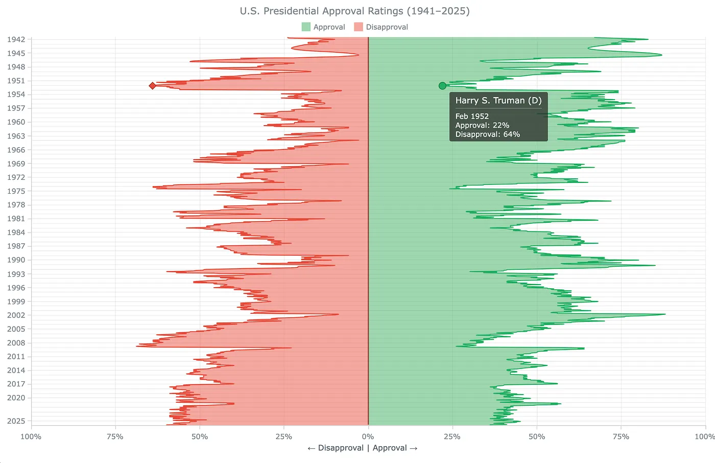
By default, the tooltip shows the raw timestamp and series value. We can make it more informative by displaying the president's name and party in the title, the calendar month in the body, and the correct percentage label for each series. This can be done through a lookup table with a function to work with it, followed by the tooltip configuration itself.
Build the President Lookup Table and Function
The lookup table is an array of objects, one per president, each holding the name, party abbreviation, and the start and end dates of their term. JavaScript Date objects use zero-based month numbers, so January = 0, April = 3, August = 7, and so on.
// each entry: president name, party, and term start and end as Date objects
const presidents = [
  {name: "Franklin D. Roosevelt", party: "D", from: new Date(1941,6,1), to: new Date(1945,3,1)},
  {name: "Harry S. Truman",       party: "D", from: new Date(1945,3,1), to: new Date(1953,0,1)},
  {name: "Dwight D. Eisenhower",  party: "R", from: new Date(1953,0,1), to: new Date(1961,0,1)},
  {name: "John F. Kennedy",       party: "D", from: new Date(1961,0,1), to: new Date(1963,10,1)},
  {name: "Lyndon B. Johnson",     party: "D", from: new Date(1963,10,1),to: new Date(1969,0,1)},
  {name: "Richard Nixon",         party: "R", from: new Date(1969,0,1), to: new Date(1974,7,1)},
  {name: "Gerald Ford",           party: "R", from: new Date(1974,7,1), to: new Date(1977,0,1)},
  {name: "Jimmy Carter",          party: "D", from: new Date(1977,0,1), to: new Date(1981,0,1)},
  {name: "Ronald Reagan",         party: "R", from: new Date(1981,0,1), to: new Date(1989,0,1)},
  {name: "George H.W. Bush",      party: "R", from: new Date(1989,0,1), to: new Date(1993,0,1)},
  {name: "Bill Clinton",          party: "D", from: new Date(1993,0,1), to: new Date(2001,0,1)},
  {name: "George W. Bush",        party: "R", from: new Date(2001,0,1), to: new Date(2009,0,1)},
  {name: "Barack Obama",          party: "D", from: new Date(2009,0,1), to: new Date(2017,0,1)},
  {name: "Donald Trump",          party: "R", from: new Date(2017,0,1), to: new Date(2021,0,1)},
  {name: "Joe Biden",             party: "D", from: new Date(2021,0,1), to: new Date(2025,0,1)},
  {name: "Donald Trump",          party: "R", from: new Date(2025,0,1), to: new Date(2029,0,1)}
];
Finding the president in office on any given date requires a function that searches the lookup table by date range. getPresident() takes a timestamp, walks through the table, and returns the matching president object. If no entry covers the date, it returns null.
// find the president in office on a given date (passed as a timestamp)
function getPresident(ts) {
  const d = new Date(ts);
  for (const p of presidents) {
    if (d >= p.from && d < p.to) return p;
  }
  return null;
}
Configure the Tooltip
Two settings merge the series data and enable HTML formatting. displayMode("union") displays both series in a single tooltip, so the viewer sees approval and disapproval for the same month side by side. useHtml(true) enables HTML markup in the tooltip body, which lets us use <br/> to put values on separate lines.
// merge both series into one tooltip and allow HTML inside it
chart.tooltip().displayMode("union");
chart.tooltip().useHtml(true);
The tooltip title should name the president in office at the hovered date. titleFormat is a callback that runs once per hovered point and returns this tooltip title string. Inside it, this.x holds the timestamp of the hovered month — passed directly to getPresident() to retrieve the president's name and party.
// tooltip title: look up the president in office on the hovered date
chart.tooltip().titleFormat(function() {
  const p = getPresident(this.x);
  return p ? (p.name + " (" + p.party + ")") : "";
});
The tooltip body should show the calendar month and the series value. format runs once per series and returns that series' line in the tooltip body. A short month-name array rebuilds the date label from the timestamp. For the disapproval series, Math.abs() converts the stored negative value back to a readable positive percentage.
// month name array for formatting the date label in the tooltip body
const MON = ["Jan","Feb","Mar","Apr","May","Jun","Jul","Aug","Sep","Oct","Nov","Dec"];

// tooltip body: show the month, then the value for each series
chart.tooltip().format(function() {
  const d = new Date(this.x);
  const label = MON[d.getMonth()] + " " + d.getFullYear();
  if (this.seriesName === "Approval") {
    return label + "<br/>Approval: " + this.value + "%";
  }
  return "Disapproval: " + Math.abs(this.value) + "%";
});
Final Result
Below is the complete interactive vertical area chart with all customizations applied — smoothed curves, custom colors, formatted axis, zero baseline, and a contextual tooltip showing the president in office for any hovered month. Feel free to explore the full code and play with it further on AnyChart Playground.
Conclusion
This tutorial covered building an interactive JavaScript vertical area chart that maps more than eight decades of public opinion data in a single view. The vertical orientation, mirrored series, and contextual tooltip make it easy to compare how approval and disapproval moved together across U.S. administrations.
Browse the gallery for more vertical chart examples. To build a horizontal area chart, see the area chart tutorial. Beyond that, explore other JavaScript charting tutorials, the supported chart types, the documentation, and the API reference.
Questions? Ask in the comments or contact the Support Team.
Comments
More Blog
View allaiContext bankruptcy: The case for strategic forgetting for AI Agents
Most of us have seen a coding agent fail to complete a task we know it can do. We just don't...
J
James O'ReillygooglecloudParallel Compliance Engine: Drive-to-Sheets Multi-Agent Orchestration
When building Generative AI applications, developers often encounter a massive bottleneck: sequential...
A
Aryan IranidiscussIs It Ethical to Post and Ask About Circuits on Dev.to?
I’ve been thinking about sharing some electronic circuit posts on Dev.to — small circuits, DIY...
C
codebunny20agentsThe One-Click Exporter: AI Studio Antigravity, Probed to Its Limits
What nobody tells you about exporting your multi-agent prototype to a local workspace. Every...
L
leslysandraagenticarchitectGuarding the till while autonomous data agents do the digging
Autonomous agents are genuinely good at answering messy business questions. Give one an LLM and a set...
S
Sireesha PulipatiaiReturn on Attention: Why AI Code Reviews Are Wearing Us Out
PR volume went up, ticket quality didn't, and the gap got filled with LLMs on both sides of the review: bots reviewing, bots replying, bots occasionally arguing with bots about priorities that only existed in a teammate's head. Our CEO named the actual problem, and it's bigger than code review.
C
christineReady-made automations for this
Workflows from the Neura Market marketplace related to this Stable Diffusion resource