
Back to Blog android
 ai
ai googlecloud
 discuss
 agents
 agenticarchitect
 ai
ai
More Accessible Focus Indicators with Compose
Eevis April 30, 2026
0 views
Last summer, I wrote a blog post about focus management with Compose. Ever since, I’ve had drafts of...
Last summer, I wrote a blog post about focus management with Compose. Ever since, I’ve had drafts of this post, but I didn’t get to finalize it until now. The blog post is available in: It's All About (Accessibility) Focus And Compose.
So, in this blog post, we’re talking about focus indicators and how to make them more accessible with Compose. But let’s first talk about focus indicators in general.
Focus Indicators
Focus indicators are, as the name suggests, indicators that show where keyboard focus currently is in the UI. They need to be visible so that keyboard and keyboard-emulating device users can navigate around the app effortlessly.
An important thing to note is that the focus indicator I’m talking about here is not for the screen reader (e.g., TalkBack) focus. That is handled on the system level.
Web Content Accessibility Guidelines (the standard behind accessibility legislation and used with apps as well, despite the name) has some requirements for accessible focus indicators. Per SC 2.4.13 Focus Appearance, the focus indicator needs to be either
- User agent’s (Android system) default styles
- At least 2 pixels thick and has a contrast ratio of at least 3:1 between the same pixels of focused and unfocused states.
Android’s default focus indicator is the ripple, which isn't very visible. Technically, it would pass, but if you want to make the application accessible, you’ll need to improve the visibility of the focus indicator. Let’s next discuss one way to build more visible (and thus, more accessible) focus indicators with Compose.
Building More Accessible Focus Indicators with Compose
There are several ways of creating the focus indicators. You can, for example, add a border based on the focused state, as Appt.org suggests in their code snippets: Accessibility focus indicator in Jetpack Compose, but if you want anything more complex, you’ll want to turn to Indication API.
Indication API with a DrawModifierNode can be used to draw complex focus indicators. In this blog post, we’re drawing a simple line under the currently focused item, first a button:
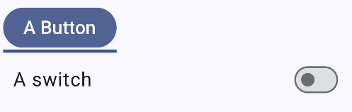
And then a switch-row:
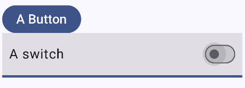
The Focus Indicator
What we’re essentially creating is a modifier that can be used in any interactive component. We want to wrap as much of the logic within the modifier and the other components so that usage in the Compose code is as easy as possible.
For this, we will need three things:
- The modifier (let’s call it
focusIndication) IndicationNodeFactoryto create the indication (FocusIndication)- And finally,
DrawModifierNodeto actually draw the focus indicator (FocusNode)
Building the Modifier
Let’s start from the bottom of the list.
To create the actual indication, we want to define a class that takes an interaction source and a color as parameters. It extends Modifier.Node() and DrawModifierNode, and overrides two methods: onAttach and ContentDrawScope.draw().
class FocusNode(
    val interactionSource: InteractionSource,
    val color: Color
) : Modifier.Node(), DrawModifierNode {
    override fun onAttach() {
        …
    }

    override fun ContentDrawScope.draw() {
        …
    }
}
The onAttach function handles the interactions. Let’s add an internal variable to store the focus state of the component, and store it within the onAttach:
private var isFocused by mutableStateOf(false)

override fun onAttach() {
    coroutineScope.launch {
        interactionSource.interactions.collect { interaction ->
            when (interaction) {
                is FocusInteraction.Focus -> isFocused = true
                is FocusInteraction.Unfocus -> isFocused = false
            }
        }
    }
}
Here, we use the interactionSource passed in in the constructor to collect the interactions with the component using this indication. We’re now interested only in the Focus-interactions, but the interactionSource.interactions also contains, for example, pressed-interactions, so this would be the place to handle them, too, if you wanted to create, for example, a custom pressed-styles.
Then, in the ContentDrawScope.draw, let’s draw the focus indicator:
override fun ContentDrawScope.draw() {
    drawContent()
    if (isFocused) {
        drawRect(
            color = color,
            topLeft = Offset(
                x = 0f,
                y = size.height - 8f
            ),
            size = Size(
                width = size.width,
                height = 12f
            )
        )
    }
}
We first draw the content with drawContent, and then, if isFocused is true, we draw a rect 12 pixels high under the component. We want to offset it slightly to position it correctly. For the color, we use the color that’s passed in in the constructor.
The next step is to use this FocusNode. We’ll create a data class that extends the IndicationNodeFactory:
private data class FocusIndication(
    val color: Color
) : IndicationNodeFactory {
    override fun create(
        interactionSource: InteractionSource
    ): Modifier.Node {
        return FocusNode(interactionSource, color)
    }
}
In the example, we override the create function and return an instance of the FocusNode we created. Finally, we define the modifier that takes in an interactionSource, and call it focusIndication:
@Composable
fun Modifier.focusIndication(
    interactionSource: MutableInteractionSource
): Modifier {
    val focusColor = MaterialTheme.colorScheme.surfaceTint
    val focusIndication = remember {
        FocusIndication(
            color = focusColor
        )
    }
    return indication(interactionSource, focusIndication)
}
First, we have the focusColor variable, which, in this example, is the surfaceTint from the theme colors. As mentioned at the beginning of the post, it should have a color contrast ratio of at least 3:1 with the same pixels in the non-focused state. This means it’s good to have dedicated light- and dark-theme colors, because it’s hard to find a single color that meets the requirements for both modes.
After that, we remember the FocusIndication we created, passing focusColor as the color parameter. Finally, we return an indication modifier with the interactionSource and focusIndication.
Hiding the Indicator on Touch Mode
Sometimes, we want to hide the focus indicator in touch mode, because it becomes visible too often when the user interacts with interactive components, or there is some manual focus management for a reason or another. It’s possible with InputModeManager’s help.
First, for the FocusNode, let’s add one more interface it extends, CompositionLocalConsumerModifierNode:
class FocusNode(
    …
) : Modifier.Node(),
DrawModifierNode,
CompositionLocalConsumerModifierNode {
    …
}
This way, we can use the value of the LocalInputModeManager, and read its input mode:
override fun ContentDrawScope.draw() {
    drawContent()
    val inputMode = currentValueOf(LocalInputModeManager).inputMode
    if (isFocused && inputMode == InputMode.Keyboard) {
        …
    }
}
We read the value with currentValueOf(LocalInputModeManager).inputMode, check that the mode is InputMode.Keyboard, and draw the focus indication only then.
Alright, now we have the focus indicator ready. How do we use it?
Using the Focus Indication Modifier
The exact usage depends on the component. For components that have built-in interaction, such as buttons or text fields, it’s straightforward. We define an interaction source, pass it to the component’s interactionSource parameter, and then call the focusIndication modifier with the same interactionSource:
val buttonInteractionSource = remember { MutableInteractionSource() }
Button(
    modifier = Modifier.focusIndication(buttonInteractionSource),
    interactionSource = buttonInteractionSource,
    onClick = {}
) {
    Text("A Button")
}
For a custom component that uses modifiers such as clickable, toggleable, or selectable for interactivity, adding a custom focus indicator requires a little bit more.
In the following example of a Switch row, I’ve omitted the parts that are strictly out of the focus indication-scope for clarity:
val switchInteractionSource = remember { MutableInteractionSource() }

Row(
    modifier = Modifier
        .focusIndication(switchInteractionSource)
        .toggleable(
            …
            indication = ripple(),
            interactionSource = switchInteractionSource
        ),

) {
    Text(
        "A switch"
    )
    Switch(
        …
        interactionSource = switchInteractionSource,
    )
}
We define an interaction source and call it switchInteractionSource. Then, we pass that interaction source to a toggleable modifier we’re using to make the whole row toggleable. We also pass in the indication as ripple() - otherwise, there wouldn’t be the ripple effect on touch.
Finally, we also pass the interaction source to Switch, so that if the user clicks the switch component, the ripple would be visible across the whole row.
Wrapping Up
In this blog post, we’ve discussed adding custom focus indicators to interactive Compose components. We’ve looked into the Indication API and how to use it, as well as creating a custom modifier to wrap the logic for easier use. You can find the complete code in this Github gist.
I have a follow-up post idea: building different kinds of focus indicators to show that you can actually get a little creative with them.
Links in the Blog Post
Comments
More Blog
View allaiContext bankruptcy: The case for strategic forgetting for AI Agents
Most of us have seen a coding agent fail to complete a task we know it can do. We just don't...
J
James O'ReillygooglecloudParallel Compliance Engine: Drive-to-Sheets Multi-Agent Orchestration
When building Generative AI applications, developers often encounter a massive bottleneck: sequential...
A
Aryan IranidiscussIs It Ethical to Post and Ask About Circuits on Dev.to?
I’ve been thinking about sharing some electronic circuit posts on Dev.to — small circuits, DIY...
C
codebunny20agentsThe One-Click Exporter: AI Studio Antigravity, Probed to Its Limits
What nobody tells you about exporting your multi-agent prototype to a local workspace. Every...
L
leslysandraagenticarchitectGuarding the till while autonomous data agents do the digging
Autonomous agents are genuinely good at answering messy business questions. Give one an LLM and a set...
S
Sireesha PulipatiaiReturn on Attention: Why AI Code Reviews Are Wearing Us Out
PR volume went up, ticket quality didn't, and the gap got filled with LLMs on both sides of the review: bots reviewing, bots replying, bots occasionally arguing with bots about priorities that only existed in a teammate's head. Our CEO named the actual problem, and it's bigger than code review.
C
christineReady-made automations for this
Workflows from the Neura Market marketplace related to this Stable Diffusion resource
- Create a WHOIS API Interface for AI Agents with 8 Domain Management Operationsn8n · Free · Related topic
- Family Assistant: Schedule, Meal & Routine Management with Email & Telegramn8n · Free · Related topic
- Conversational Google Calendar Management with Claude 3.5, Haiku & Telegramn8n · Free · Related topic
- Monitor Customer Churn Indicators with Bright Data MCP and OpenAIn8n · Free · Related topic