
Back to Blog javascript
 ai
ai googlecloud
 discuss
 agents
 agenticarchitect
 ai
ai
I stopped generating color scales and started shaping them
Gil Barbara June 23, 2026
0 views
Generating a color scale is a solved problem. Hand most tools a color and you get back eleven valid,...
Generating a color scale is a solved problem. Hand most tools a color and you get back eleven valid, perceptually even steps. The trouble is they tend to come out a little lifeless: chalky tints, every step interchangeable, technically correct and slightly generic.
The scale you actually want has intent: clean highlights, shadows with depth, contrast spent where your UI needs it. The gap between the two isn't more math — it's a few controls, and a way to see what they're doing.
I maintain a small color library, colorizr, and its scale() does the generating part: one color in, a full scale out:
import { scale } from 'colorizr';

scale('#ff38af');
// { 50: '#ffeff7', 100: '#ffe2f1', …, 500: '#ff3fb4', …, 950: '#31001c' }
Even, valid, fine. The interesting part is everything after the default — the controls that let you shape it.
The catch: you'd be shaping blind
Here's why this takes more than an API. Most of these controls are gamut-relative: they work against the maximum chroma a color can physically exhibit, and that ceiling shifts with hue and lightness at every step. There's no fixed range to picture the way there is in HSL — set chromaCurve: { low: 0.6, high: 0.4 } and you'd have no real idea what you just did.
So the app isn't a product wrapped around the library, it's a visualizer for it. The scale on screen, every control on a slider, and a chart for the parts you can't see.
Chroma curve — shaped against the ceiling
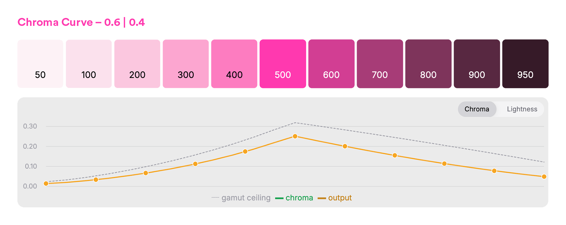
scale('#ff38af', { chromaCurve: { low: 0.6, high: 0.4 } });
The dotted line is the gamut ceiling; the solid line is what the scale uses. You shape chroma as a fraction of the ceiling, so the tints stay clean and nothing clips — per step, per hue. Hold chroma flat instead, and those pale steps go chalky. That's the whole difference between a washed-out light end and a clean one, and it's not a number you'd ever land on by eye.
Hue shift — depth across the range
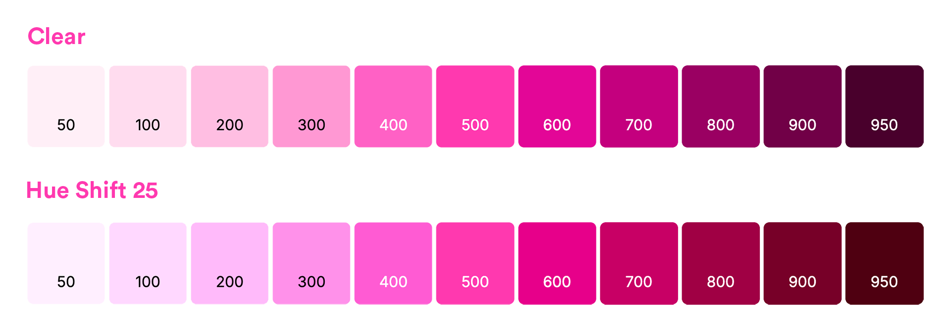
scale('#ff38af', { hueShift: 25 });
Pinning one hue across the whole scale is part of what reads synthetic. Rotate it a few degrees toward the ends — warm the shadows, cool the tints — and the scale gains the sense of light moving through it that hand-mixed palettes have. The middle stays locked to your base; the visualizer shows you how far is too far before your pink drifts into orange.
There's more in the same spirit: a lightness curve to decide where the contrast lives, a min/max lightness range to set the endpoints, and they all work the same way: a slider and a chart, so the choice is something you see, not something you guess.
The payoff
That's the whole loop: shape the scale against the charts until it has the character you want, then take it to code. The visualizer hands you the result, export-ready — CSS variables, Tailwind, SCSS — and if you'd rather skip the UI, the same controls are available in colorizr for your build.
Same base color across all images above. The numbers won't tell you which scale you want; shaping it where you can see it will.
- colorizr - the engine.
npm i colorizr, generate and shape scales in code, export-ready. - the visualizer - shape against the gamut ceiling, watch the curves, copy the result out.
Comments
More Blog
View allaiContext bankruptcy: The case for strategic forgetting for AI Agents
Most of us have seen a coding agent fail to complete a task we know it can do. We just don't...
J
James O'ReillygooglecloudParallel Compliance Engine: Drive-to-Sheets Multi-Agent Orchestration
When building Generative AI applications, developers often encounter a massive bottleneck: sequential...
A
Aryan IranidiscussIs It Ethical to Post and Ask About Circuits on Dev.to?
I’ve been thinking about sharing some electronic circuit posts on Dev.to — small circuits, DIY...
C
codebunny20agentsThe One-Click Exporter: AI Studio Antigravity, Probed to Its Limits
What nobody tells you about exporting your multi-agent prototype to a local workspace. Every...
L
leslysandraagenticarchitectGuarding the till while autonomous data agents do the digging
Autonomous agents are genuinely good at answering messy business questions. Give one an LLM and a set...
S
Sireesha PulipatiaiReturn on Attention: Why AI Code Reviews Are Wearing Us Out
PR volume went up, ticket quality didn't, and the gap got filled with LLMs on both sides of the review: bots reviewing, bots replying, bots occasionally arguing with bots about priorities that only existed in a teammate's head. Our CEO named the actual problem, and it's bigger than code review.
C
christineReady-made automations for this
Workflows from the Neura Market marketplace related to this Stable Diffusion resource
- Generating Image Embeddings via Textual Summarisationn8n · $18.99 · Related topic
- Generating Keywords & Search Volumes via Google Ads APIn8n · $18.99 · Related topic
- Get Started with Google Sheets & AI in n8nn8n · $12.99 · Related topic
- n8n Basic Getting Started Workflow: Interval, Function & Setn8n · $4.99 · Related topic